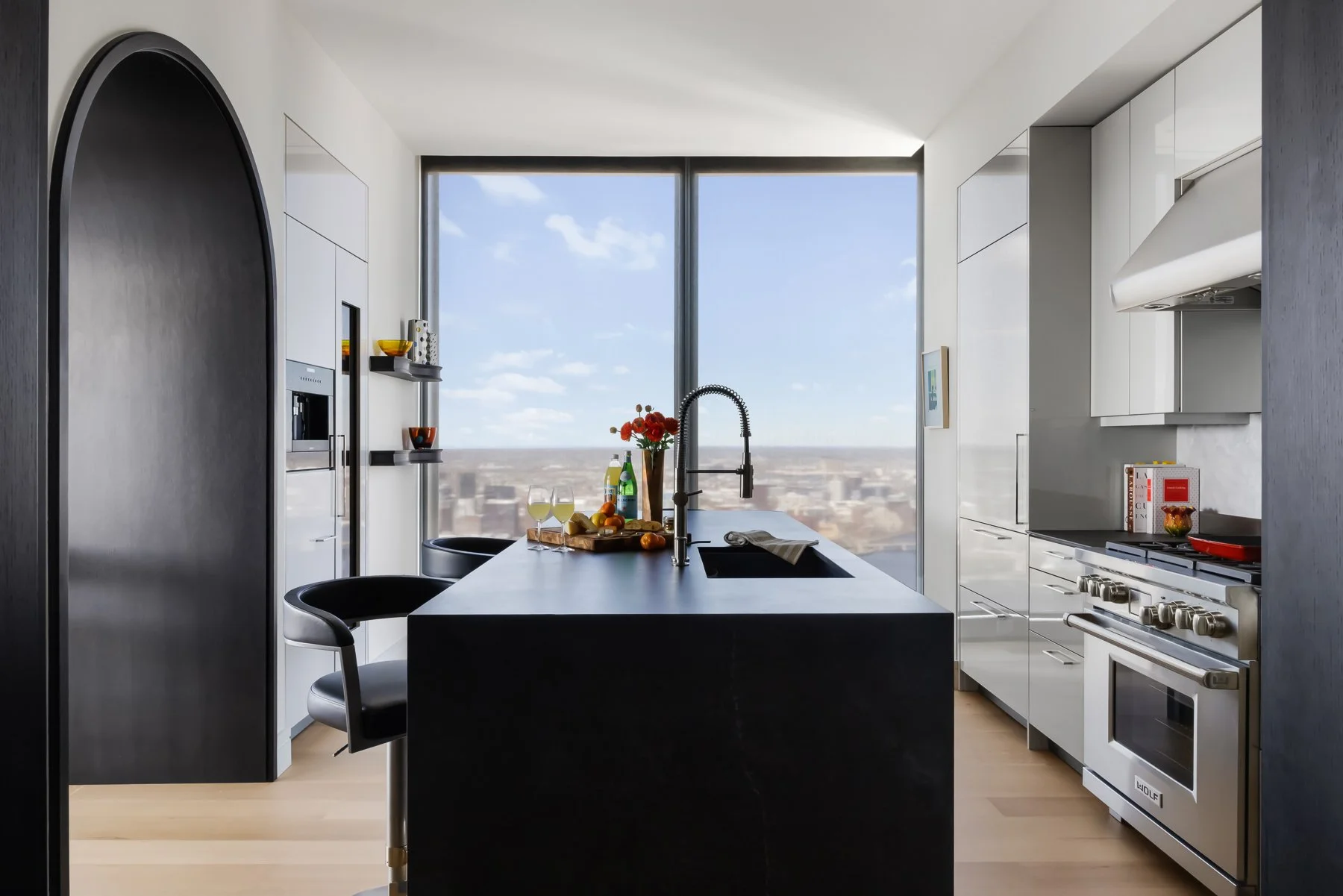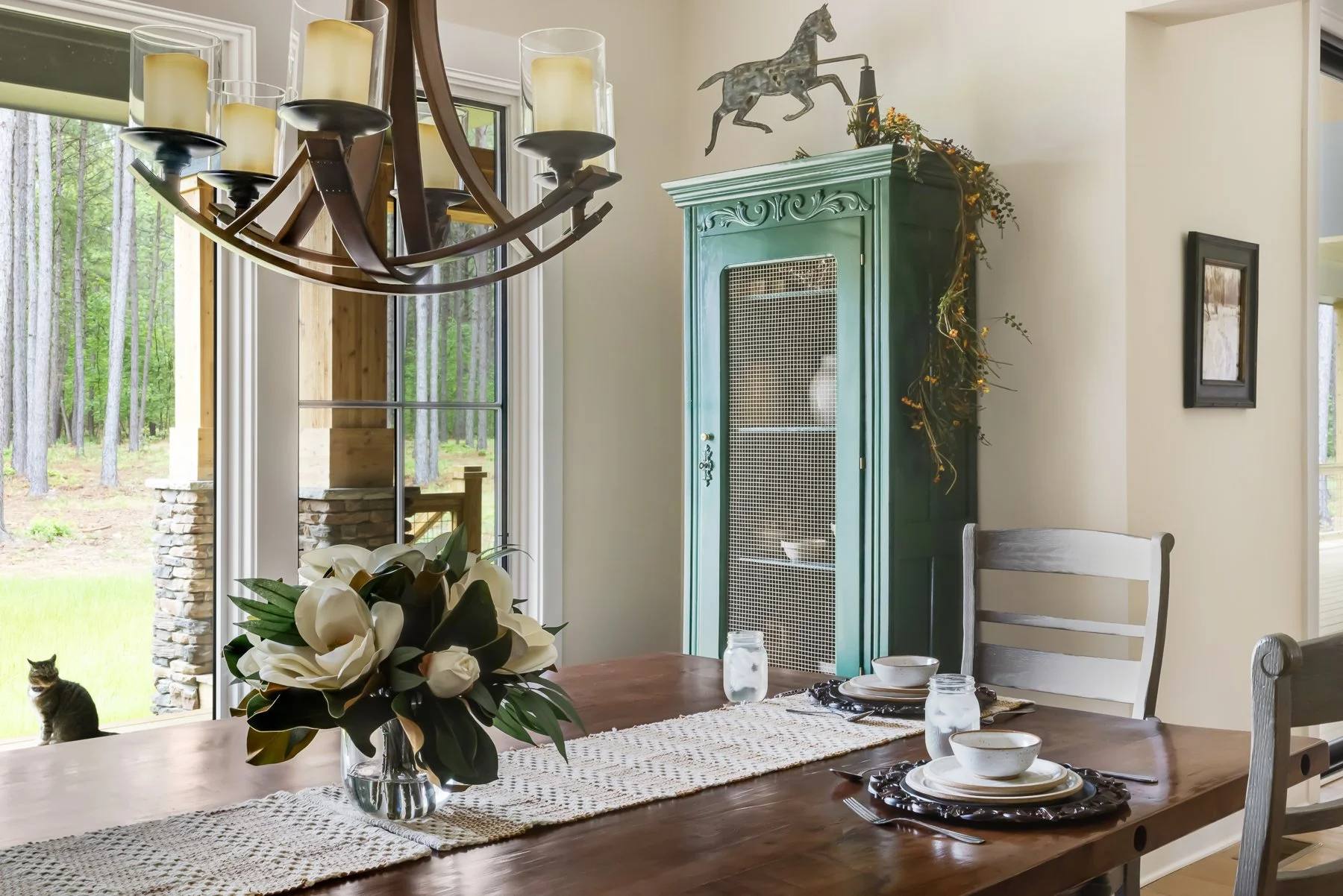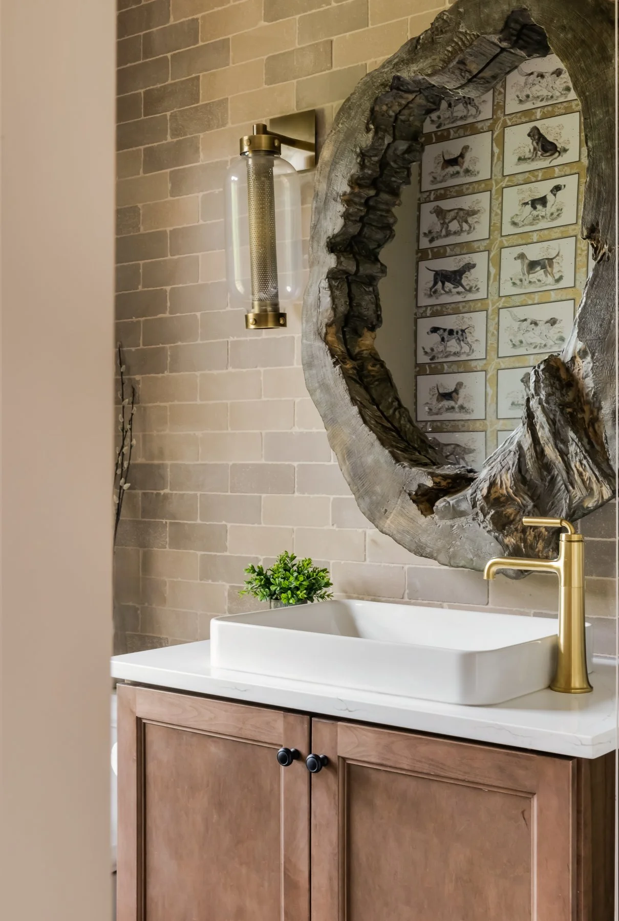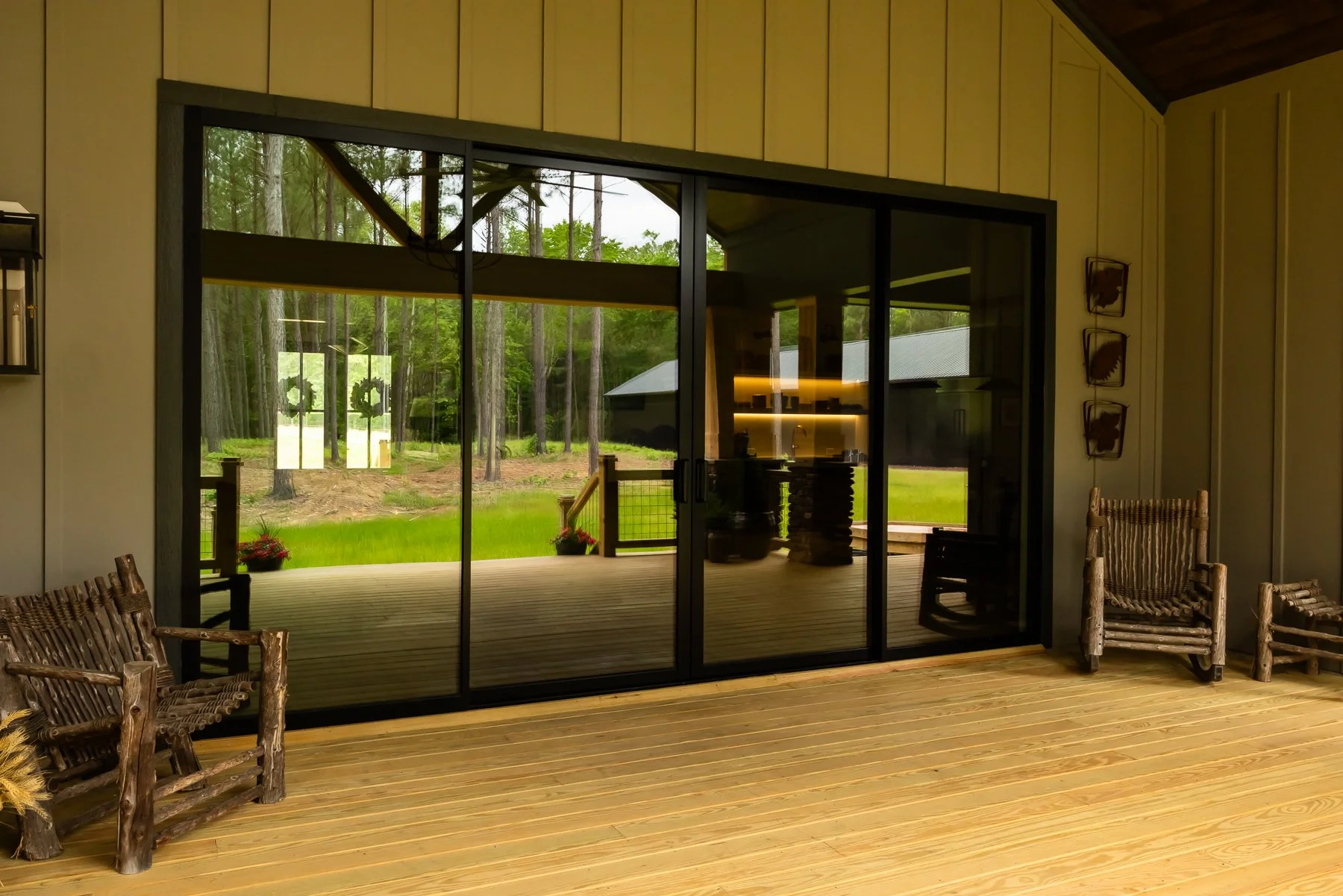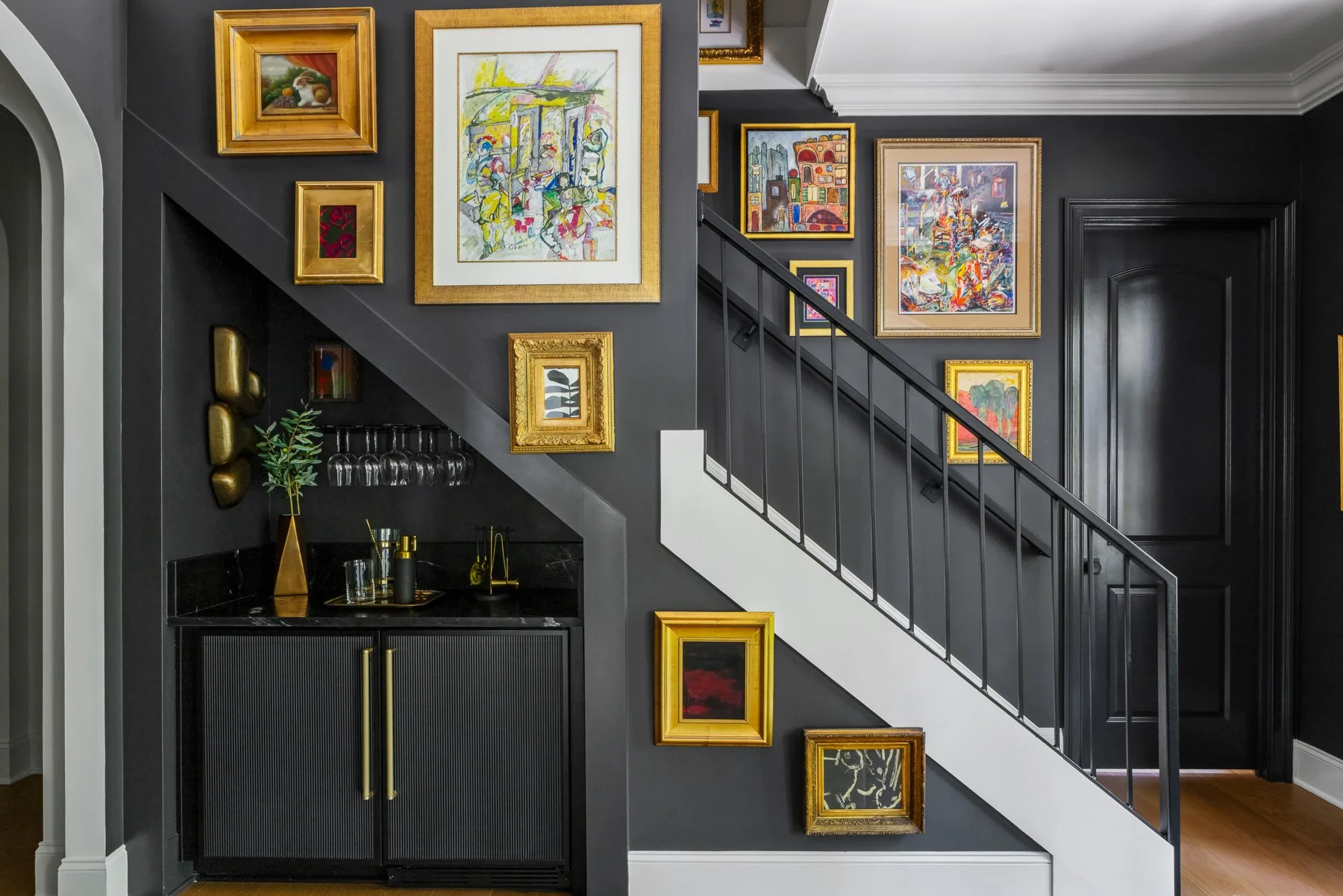
Trends are worth paying attention to and worth holding loosely. These are the current directions we think have staying power, and how to use them without dating a room.
Warm earth tones
The move away from cool greys has settled into something genuinely liveable: clay, ochre, olive, warm plaster. Use them on the large surfaces where they will do the most work, and let them be quiet.
Texture doing the work of colour
Bouclé, chenille, cerused oak, honed stone, unlacquered brass. A tonal room with five textures in it reads as rich; a tonal room with one reads as unfinished.
Pattern, mixed with intent
Mixing patterns works when the scales differ and something ties them together, usually a shared colour. One large, one medium, one small is a reliable place to start.
Lived-in over showroom
The most durable idea here is the least fashionable one: rooms should look like people use them. Vintage pieces, real books, imperfect surfaces. That is what stops a scheme reading as a catalogue page.